file-manager
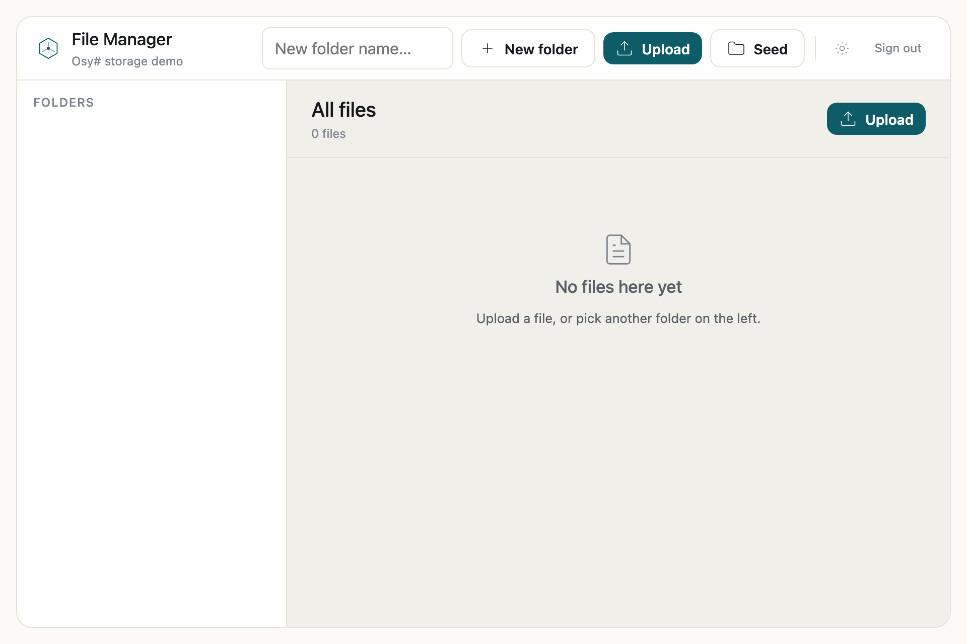
Files and folders — upload, download, move and delete, with a folder tree.
8 source files2 test files
Get it
$ osy init file-manager
$ osy launch
The app
app.osy13 lines
// Files and folders — upload, download, move and delete, with a folder tree.
// A dogfood demo of the FileAsset model (parity F4 slice 7). A folder tree (a vendored headless-tree
// FOREIGN CONTROL), file upload + public download, per-file metadata, folder create / file move / delete, and the
// "pick the hero" re-point flow (a Product points at a FileAsset — which is what makes some files IsReferenced vs
// orphaned). Exercises FileAsset + Folder + Osyrin.Images + IsReferenced + a foreign control in one artifact.
app FileManager {
  use Osyrin.Storage;                          // FileAsset / FileGrant / Folder + the File.* path store
  use Osyrin.Images;                           // the Image.* thumbnail surface
  use Osyrin.Ui;
  model "model/**/*.osy";
  tests "tests/**/*.test.osy";
}
model/auth.osy46 lines
// Auth for the file manager (the security model: a [Principal] + AuthBootstrap, secure-by-default). A real principal
// is what makes the file model work — FileAsset/Folder are creator-owns, so "your files" needs a `user` to own them.
// Adapted from demo/auth-demo. See Docs/reference/security/index.md.

[Role] enum AppRole { Authenticator, Member }

entity RoleGrant {
  User Grantee;
  [Required] AppRole Level;
  security { }
}

policy IsAuthenticator => RoleGrant.Any(g => g.Grantee == user && g.Level == AppRole.Authenticator);

[Principal] entity User {
  [MaxLength(200), Unique] string Email;
  [MaxLength(200)] string PasswordHash;
  security {
    deny read PasswordHash when !IsAuthenticator;
    allow read when IsAuthenticator;
    allow create when IsAuthenticator;
    allow update when IsAuthenticator;
  }
}

[AuthMethod]
string Signup(string email, string password) {
  var u = new User { Email = email, PasswordHash = Security.HashPassword(password) };
  return Security.IssueJwt(u.Id, u.Email);
}

[AuthMethod]
string Login(string email, string password) {
  var u = User.Where(x => x.Email == email).FirstOrDefault();
  if (u == null) { Security.VerifyPassword(password); return ""; }
  if (Security.VerifyPassword(password, u.PasswordHash)) { return Security.IssueJwt(u.Id, u.Email); }
  return "";
}

app.AuthBootstrap = new AuthBootstrap {
  Role      = AppRole.Authenticator,
  Login     = Login,
  Signup    = Signup,
  LoginPage = LoginPage,
};
model/functions.osy71 lines
using Osyrin.Storage;
using Osyrin.Images;

void CreateRootFolder(string name) {
  new Folder { Name = name };
  UnitOfWork.Commit();
}

void CreateSubfolder(string name, Guid parentId) {
  if (name == "") { return; }
  var parent = parentId == Guid.Empty ? null : Folder.Single(x => x.Id == parentId);
  new Folder { Name = name, Parent = parent };
  UnitOfWork.Commit();
}

void SeedFolders() {
  var photos = new Folder { Name = "Photos" };
  var docs = new Folder { Name = "Documents" };
  var y2024 = new Folder { Name = "2024", Parent = photos };
  new Folder { Name = "2025", Parent = photos };
  var invoices = new Folder { Name = "Invoices", Parent = docs };
  var contracts = new Folder { Name = "Contracts", Parent = docs };

  new FileAsset { Name = "welcome.txt", MimeType = "text/plain", Size = 1240, StorageMode = "inline", IsPublic = true };
  new FileAsset { Name = "getting-started.pdf", MimeType = "application/pdf", Size = 48210, StorageMode = "inline" };

  new FileAsset { Name = "sunset.jpg", MimeType = "image/jpeg", Size = 2841600, StorageMode = "inline", IsPublic = true, Folder = photos };
  new FileAsset { Name = "portrait.png", MimeType = "image/png", Size = 845000, StorageMode = "inline", Folder = photos };
  new FileAsset { Name = "birthday.jpg", MimeType = "image/jpeg", Size = 1920000, StorageMode = "inline", Folder = y2024 };

  new FileAsset { Name = "invoice-jan.pdf", MimeType = "application/pdf", Size = 128400, StorageMode = "inline", Folder = invoices };
  new FileAsset { Name = "invoice-feb.pdf", MimeType = "application/pdf", Size = 131900, StorageMode = "inline", Folder = invoices };
  new FileAsset { Name = "nda-signed.pdf", MimeType = "application/pdf", Size = 512000, StorageMode = "inline", IsPublic = false, Folder = contracts };

  UnitOfWork.Commit();
}

void RemoveFile(Guid fileId) {
  var f = FileAsset.Single(x => x.Id == fileId);
  f.Delete();
  UnitOfWork.Commit();
}

void Ingest(UploadedFile f, Guid folderId) {
  var bytes = File.ReadAllBytes(f.Path);
  var folder = folderId == Guid.Empty ? null : Folder.Single(x => x.Id == folderId);
  new FileAsset {
    Name = f.FileName,
    MimeType = f.ContentType,
    StorageMode = "inline",
    InlineData = bytes,
    Folder = folder
  };
  UnitOfWork.Commit();
}

FileAsset Thumbnail(FileAsset source) {
  return Image.Thumbnail(source, 128);
}

string MimeFor(string name) {
  if (name.EndsWith(".png")) { return "image/png"; }
  if (name.EndsWith(".jpg")) { return "image/jpeg"; }
  if (name.EndsWith(".jpeg")) { return "image/jpeg"; }
  if (name.EndsWith(".gif")) { return "image/gif"; }
  if (name.EndsWith(".webp")) { return "image/webp"; }
  if (name.EndsWith(".svg")) { return "image/svg+xml"; }
  if (name.EndsWith(".pdf")) { return "application/pdf"; }
  return "application/octet-stream";
}
model/model.osy10 lines
using Osyrin.Storage;   // FileAsset, FileGrant, Folder — the first-class file model
using Osyrin.Images;    // Image.* — server-side thumbnails

entity Product {
  [Required, MaxLength(120)] string Name;
  FileAsset Hero;
  security { allow read, create, update, delete when IsAuthenticated; }
}
model/theme.osy74 lines
// File Manager — the design tokens (forked from the New Admin design system: osyrin cerulean, warm-cream / cool-slate,
// light + dark). Components read the PURPOSE layer only (`Bg = Colors.Surface1`), never a raw hex, so the whole app follows
// light/dark for free. See the original for the authoring rules (length tokens carry their unit; a token name denotes
// one value app-wide).

theme FileManager {

  Colors {
    Surface0 = Modes.Of(light: "#f5f4f0", dark: "#0d1a24");   // page canvas — warm cream / near-black navy
    Surface1 = Modes.Of(light: "#faf9f5", dark: "#0f2130");   // in-flow card / sidebar / rail
    Surface2 = Modes.Of(light: "#ffffff", dark: "#0f2535");   // panel / working area / raised card
    Surface3 = Modes.Of(light: "#ffffff", dark: "#14304a");   // popover / menu / dropdown

    TextPrimary   = Modes.Of(light: "#1a1a1a", dark: "#d0eaf7");
    TextSecondary = Modes.Of(light: "#64748b", dark: "#89acc6");   // slate-500 / cerulean-slate
    TextMuted     = Modes.Of(light: "#94a3b8", dark: "#5b7d96");   // slate-400
    TextDisabled  = Modes.Of(light: "rgba(26, 26, 26, 0.32)", dark: "rgba(208, 234, 247, 0.32)");

    Border         = Modes.Of(light: "#e2e8f0", dark: "#1a3a52");
    BorderStrong   = Modes.Of(light: "#cbd5e1", dark: "#244a66");
    BorderStronger = Modes.Of(light: "#94a3b8", dark: "#2f5a7a");

    BgAccent     = Modes.Of(light: "#e8f4fb", dark: "#10283b");   // cerulean tint
    TextAccent   = Modes.Of(light: "#005f92", dark: "#8fceeb");   // readable cerulean on the tint
    FillAccent   = Modes.Of(light: "#0077b6", dark: "#48b4e0");   // the osyrin cerulean
    BorderAccent = Modes.Of(light: "#a9d3ec", dark: "#2b5b7a");
    OnAccent     = "#ffffff";

    BgSuccess     = Modes.Of(light: "#eaf3de", dark: "#182410");
    TextSuccess   = Modes.Of(light: "#3b6d11", dark: "#a5cf6c");
    FillSuccess   = Modes.Of(light: "#639922", dark: "#5f9220");
    BorderSuccess = Modes.Of(light: "#c0dd97", dark: "#35521c");

    BgWarning     = Modes.Of(light: "#faeeda", dark: "#2a1e0c");
    TextWarning   = Modes.Of(light: "#854f0b", dark: "#e3b167");
    FillWarning   = Modes.Of(light: "#ba7517", dark: "#b06f16");
    BorderWarning = Modes.Of(light: "#fac775", dark: "#5b4014");

    BgDanger     = Modes.Of(light: "#fcebeb", dark: "#2b1413");
    TextDanger   = Modes.Of(light: "#a32d2d", dark: "#ef8d8c");
    FillDanger   = Modes.Of(light: "#e24b4a", dark: "#d64645");
    BorderDanger = Modes.Of(light: "#f7c1c1", dark: "#5d2a29");

    FillPrimary = Modes.Of(light: "#1a1a1a", dark: "#d0eaf7");
    OnPrimary   = Modes.Of(light: "#ffffff", dark: "#0f2535");

    Bg      = Colors.Surface0;     // <body> background
    OnBg    = Colors.TextPrimary;  // <body> colour
    Surface = Colors.Surface2;     // an unstyled Input / the theme toggle sits on a panel
    OnSurface = Colors.TextPrimary;
    Muted   = Modes.Of(light: "#eef1f5", dark: "#14304a");   // an unstyled Button's neutral fill

    Primary = Palette.From("#0077b6");   // the osyrin cerulean; also the focus ring (§2: focus is an accent role)
    Danger  = Palette.From("#e24b4a");
    Success = Palette.From("#639922");
    Warning = Palette.From("#ba7517");
  }

  Radius { Sm = "6px"; Md = "8px"; Lg = "12px"; Pill = "999px"; }

  Font { Sans = "\"Helvetica Neue\", Helvetica, Arial, sans-serif";
         Mono = "ui-monospace, SFMono-Regular, \"SF Mono\", Menlo, Consolas, monospace"; }
  FontSize   { Caption = "12px"; Label = "13px"; Body = "13px"; Subhead = "16px"; Heading = "18px"; Title = "22px"; }
  FontWeight { Light = 300; Regular = 400; Medium = 500; Semibold = 500; }

  Density { ControlHeight = "32px"; RowHeight = "34px"; NavHeight = "32px"; CellPadY = "7px"; }

  Breakpoints { Compact = 640; Cozy = 960; }
  Touch       { Min = "44px"; Dense = "36px"; }

  ZIndex { Drawer = 20; Fab = 30; Overlay = 40; }
  Motion { Fade = "opacity 0.12s ease"; Tint = "background 0.12s ease, color 0.12s ease"; }
}
model/controls/tree.osy27 lines
// The folder-tree FOREIGN CONTROL (parity F4 slice 7) — a headless adapter over `@headless-tree/core`, bundled into
// the sibling shim `tree.js` with esbuild.
// HEADLESS: the library computes the tree state (expand/collapse/selection) and the shim renders the DOM THROUGH the
// app's design tokens (host.tokens), so the tree inherits the app's theme + dark mode. The app hands in a FLAT list of
// nodes (each carrying its parent's id) and the shim builds the hierarchy — the same "flatten the entity to a plain
// record" contract the DataGrid uses. Selecting a folder emits its IDENTITY (the Folder's id), never a display index.

// The control's OWN shape type (never the app's `Folder` entity directly — a control stays reusable across apps). The
// page projects each `Folder` into one of these. `ParentId` is `Guid.Empty` for a root; the shim roots those.
class FolderNode {
  public Guid FolderId;   // the Folder's id — emitted on select, and the node's stable key
  public string Name;     // the folder's display label
  public Guid ParentId;   // the parent Folder's id, or Guid.Empty for a top-level folder
}

control FolderTree {
  contractVersion "1.0"
  version "1.0.0"
  participation headless
  props {
    FolderNode[] nodes;
  }
  events {
    folderSelected(Guid id);
  }
}
model/pages/login.osy98 lines
// Login + signup — the two public routes ([AllowAnonymous]; not under any layout, so they render full-viewport). Each
// is a single card in the app's design language (cerulean on a warm-cream canvas, flat + hairline). Their Submit calls
// the Side=Server credential [AuthMethod] and hands the ticket to Session.SignIn, which stores it and navigates on.
// AuthBootstrap routes an anonymous visit to a protected page here.

using Osyrin.Ui;

[Page("/login")]
[AllowAnonymous]
[Title("Sign in")]
[Render(CSR)]
component LoginPage() {
  string email = "";
  string password = "";
  action Submit() { Session.SignIn(Login(email, password)); }
  render {
    AuthShell {
      AuthCard {
        AuthBrand();
        Stack(gap: 1, align: Align.Center) {
          Text("Sign in", fontSize: FontSize.Title, fontWeight: FontWeight.Medium, color: Colors.TextPrimary);
          Hint("Welcome back to your files.");
        }
        Stack(gap: 3) {
          Field("Email",    value: email,    placeholder: "you@company.com");
          Field("Password", value: password, placeholder: "••••••••", type: "password");
        }
        Pressable(onClick: Submit) { AuthPrimary("Sign in"); }
        AuthSwitch("New here?", "Create an account", "/signup");
      }
    }
  }
}

[Page("/signup")]
[AllowAnonymous]
[Title("Create your account")]
[Render(CSR)]
component SignupPage() {
  string email = "";
  string password = "";
  action Submit() { Session.SignIn(Signup(email, password)); }
  render {
    AuthShell {
      AuthCard {
        AuthBrand();
        Stack(gap: 1, align: Align.Center) {
          Text("Create your account", fontSize: FontSize.Title, fontWeight: FontWeight.Medium, color: Colors.TextPrimary);
          Hint("Sign up to start organizing your files.");
        }
        Stack(gap: 3) {
          Field("Email",    value: email,    placeholder: "you@company.com");
          Field("Password", value: password, placeholder: "••••••••", type: "password");
        }
        Pressable(onClick: Submit) { AuthPrimary("Create account"); }
        AuthSwitch("Already have an account?", "Sign in", "/login");
      }
    }
  }
}

/// The full-viewport canvas that centers the card.
[Composable] component AuthShell() {
  variants { base { MinH = "100vh"; Bg = Colors.Surface0; Color = Colors.TextPrimary; P = 4; } }
  render { Row(align: Align.Center, justify: Justify.Center) { Slot; } }
}
/// The auth card — a Surface2 hairline panel, ~380px wide.
[Composable] component AuthCard() {
  variants { base { W = "380px"; MaxW = "100%"; Bg = Colors.Surface2; BorderW = 1; Border = Colors.Border; Rounded = Radius.Lg; P = 5; } }
  render { Stack(gap: 4) { Slot; } }
}
/// The brand lockup — the cerulean mark over the app name.
[Composable] component AuthBrand() {
  variants { base { Display = Display.Flex; } }
  render {
    Stack(gap: 2, align: Align.Center) {
      Icon(Icons.Logo, size: 30, color: Colors.TextAccent);
      Text("File Manager", fontSize: FontSize.Heading, fontWeight: FontWeight.Medium, color: Colors.TextPrimary, letterSpacing: "0.01em");
    }
  }
}
/// The one cerulean action — a full-width primary button.
[Composable] component AuthPrimary(string label) {
  variants { base { Display = Display.Flex; H = "40px"; W = "100%"; Bg = Colors.FillAccent; Color = Colors.OnAccent; Rounded = Radius.Md;
                    FontSize = FontSize.Body; FontWeight = FontWeight.Medium; Transition = Motion.Tint; } }
  render { Row(align: Align.Center, justify: Justify.Center) { Text(label); } }
}
/// The mode switch line under the button — a hint + an accent link to the other page.
[Composable] component AuthSwitch(string prompt, string linkText, string href) {
  variants { base { Display = Display.Flex; } }
  render {
    Row(gap: 1, align: Align.Center, justify: Justify.Center) {
      Hint(prompt);
      Link(href: href) { Text(linkText, color: Colors.TextAccent, fontSize: FontSize.Body, fontWeight: FontWeight.Medium); }
    }
  }
}
model/pages/manager.osy233 lines
using Osyrin.Ui;
using Osyrin.Storage;

[Page("/")]
[Title("File Manager")]
[Render(CSR)]
component FileManagerPage() {
  Guid selectedId = Guid.Empty;                  // the open folder (Guid.Empty = the "All files" root view)
  string folderName = "All files";               // the open folder's display name (for the file-panel header)
  string newFolderName = "";
  live var loadedNodes = Folder.Select(f => new FolderNode {
    FolderId = f.Id,
    Name = f.Name,
    ParentId = f.Parent?.Id ?? Guid.Empty
  }).ToList();

  live var loadedFiles = FileAsset.Where(f => selectedId == Guid.Empty || f.Folder.Id == selectedId).ToList();

  action SelectFolder(Guid id) {
    selectedId = id;
    folderName = "All files";
    foreach (var n in loadedNodes) {
      if (n.FolderId == id) { folderName = n.Name; }
    }
  }
  action NewFolder() { CreateSubfolder(newFolderName, selectedId); newFolderName = ""; }
  action Seed() { SeedFolders(); }
  action Uploaded(UploadedFile f) { Ingest(f, selectedId); }
  action DeleteFile(Guid id) { RemoveFile(id); }
  action OpenFile(FileAsset f) { Navigation.Go("/file/" + f.Id); }

  render {
    FmShell {
      CommandBar {
        Icon(Icons.Logo, size: 22, color: Colors.TextAccent);
        Stack(gap: 0) {
          Text("File Manager", fontSize: FontSize.Subhead, fontWeight: FontWeight.Medium, color: Colors.TextPrimary);
          FieldLabel("Osy# storage demo");
        }
        Spacer();
        Row(gap: 2, align: Align.Center, wrap: Wrapping.Wrap) {
          Input(value: newFolderName, label: "New folder name", placeholder: "New folder name…", w: "190px");
          Button("New folder", onPress: NewFolder) { Icon(Icons.Plus, size: 18); }
          UploadButton(Uploaded);
          Button("Seed", onPress: Seed) { Icon(Icons.Folder, size: 18); }
          Sep2();
          ThemeToggle();
          SignOutButton();
        }
      }

      BodyRow {
        if (Layout.AtLeast(Compact)) {
          TreePanel {
            PanelHead { SectionLabel("Folders"); }
            TreeScroll {
              FolderTree(nodes: loadedNodes, folderSelected: SelectFolder);
            }
          }
        }

        FilePanel {
          FilePanelHead {
            Stack(gap: 0) {
              Text(folderName, fontSize: FontSize.Heading, fontWeight: FontWeight.Medium, color: Colors.TextPrimary);
              Text(loadedFiles.Count == 1 ? "1 file" : loadedFiles.Count + " files", fontSize: FontSize.Caption, color: Colors.TextMuted);
            }
            Spacer();
            UploadButton(Uploaded);
          }
          FileBody {
            if (loadedFiles.Count == 0) {
              EmptyFiles {
                Icon(Icons.File, size: 34, color: Colors.TextMuted);
                Text("No files here yet", fontSize: FontSize.Subhead, fontWeight: FontWeight.Medium, color: Colors.TextSecondary);
                Hint("Upload a file, or pick another folder on the left.");
              }
            } else {
              DataGrid(
            label: "Files",
                rows: loadedFiles,
                columns: [
                  new GridColumn<FileAsset> { Name = "Name", Label = "Name", Value = f => f.Name, Title = true, Width = 300, Fill = true },
                  new GridColumn<FileAsset> { Name = "MimeType", Label = "Type", Value = f => f.MimeType, Secondary = true, Width = 200 },
                  new GridColumn<FileAsset> { Name = "Size", Label = "Size", Value = f => Text.ByteSize(f.Size), Align = "right", Width = 120 },
                  new GridColumn<FileAsset> { Name = "IsPublic", Label = "Visibility", Value = f => f.IsPublic ? "Public" : "Private", Width = 140 },
                  new GridColumn<FileAsset> { Name = "Actions", Label = "", Value = f => "", Width = 80, Align = "right", Sortable = false }
                ],
                rowSelected: OpenFile
              ) { f =>
                Stack(gap: 0) { Strong(f.Name); FieldLabel(f.MimeType); }

                slot IsPublic { f =>
                  Row(align: Align.Center) {
                    if (f.IsPublic) { Badge("Public", tone: Tone.Success); }
                    else { Badge("Private", tone: Tone.Ghost); }
                  }
                }
                slot Actions { f =>
                  Row(align: Align.Center, justify: Justify.End) {
                    IconButton("Delete " + f.Name, () => DeleteFile(f.Id), tone: Tone.Danger) {
                      Icon(Icons.Trash, size: 16);
                    }
                  }
                }
              }
            }
          }
        }
      }
    }
  }
}

/// The canvas + floating card: a Surface0 gutter (Cozy) around a Surface2 hairline card that clips its children, so
/// the tree's right edge and the grid's scroll live inside the rounded corners.
// region: shell
[Composable] component FmShell() {
  variants { base { Display = Display.Flex; MinH = "100vh"; Bg = Colors.Surface0; Color = Colors.OnBg; Cozy { P = "16px"; } } }
  render { Row(align: Align.Stretch) { FmCard { Slot; } } }
}
// endregion
[Composable] component FmCard() {
  variants { base { Grow = 1; MinW = "0"; Bg = Colors.Surface2; Overflow = Overflow.Hidden; Cozy { BorderW = 1; Border = Colors.Border; Rounded = Radius.Lg; } } }
  render { Stack(gap: 0) { Slot; } }   // column: command bar on top, body row below
}

/// The top command bar — brand + title on the left, the app's actions on the right, over a bottom hairline.
[Composable] component CommandBar() {
  variants { base { Display = Display.Flex; Px = "20px"; MinH = "60px"; Py = "10px"; Wrap = Wrapping.Wrap; Bg = Colors.Surface1; BorderBW = 1; Border = Colors.Border; } }
  render { Row(gap: 3, align: Align.Center, wrap: Wrapping.Wrap) { Slot; } }
}

/// The body — fills the card below the command bar; a flex row of the two panels, each free to scroll (MinH 0).
[Composable] component BodyRow() {
  variants { base { Grow = 1; MinH = "0"; Display = Display.Flex; } }
  render { Row(align: Align.Stretch) { Slot; } }
}

/// The left folder panel — a fixed-width Surface1 column with a right hairline.
[Composable] component TreePanel() {
  variants { base { W = "268px"; MinW = "268px"; MinH = "0"; Bg = Colors.Surface1; BorderRW = 1; Border = Colors.Border; Display = Display.Flex; } }
  render { Stack(gap: 0, role: UiRole.Region, label: "Folders") { Slot; } }
}
/// A panel's small padded header row (the "FOLDERS" eyebrow).
[Composable] component PanelHead() {
  variants { base { Px = "16px"; Pt = "16px"; Pb = "8px"; } }
  render { Row(align: Align.Center) { Slot; } }
}
/// The scrolling tree region.
[Composable] component TreeScroll() {
  variants { base { Grow = 1; MinH = "0"; OverflowY = Overflow.Auto; Px = "8px"; Pb = "12px"; } }
  render { Stack(gap: 0) { Slot; } }
}

/// The right file panel — grows to fill, a flex column of its header + scrolling body.
[Composable] component FilePanel() {
  variants { base { Grow = 1; MinW = "0"; MinH = "0"; Bg = Colors.Surface2; Display = Display.Flex; } }
  render { Stack(gap: 0, role: UiRole.Region, label: "Files") { Slot; } }
}
/// The file panel's header — the open folder's name + file count on the left, an upload on the right, over a hairline.
[Composable] component FilePanelHead() {
  variants { base { Px = "24px"; Py = "14px"; BorderBW = 1; Border = Colors.Border; } }
  render { Row(gap: 3, align: Align.Center) { Slot; } }
}
/// The scrolling file region.
[Composable] component FileBody() {
  variants { base { Grow = 1; MinH = "0"; OverflowY = Overflow.Auto; Px = "24px"; Py = "18px"; } }
  render { Stack(gap: 0) { Slot; } }
}

/// The empty-state placeholder shown when the open folder has no files — a centered glyph + hint.
[Composable] component EmptyFiles() {
  variants { base { Display = Display.Flex; Py = "56px"; Gap = "10px"; } }
  render { Stack(gap: 2, align: Align.Center, justify: Justify.Center) { Slot; } }
}

/// A short vertical hairline divider for the command bar.
[Composable] component Sep2() {
  variants { base { W = "1px"; H = "24px"; Bg = Colors.Border; Mx = "2px"; } }
  render { Box(); }
}

/// Theme flip — the platform's `Theme.Toggle()` client effect (flips + persists `data-theme`).
[Composable] component ThemeToggle() {
  action Flip() { Theme.Toggle(); }
  variants { base { W = "32px"; H = "32px"; Rounded = Radius.Md; Color = Colors.TextMuted; Transition = Motion.Tint; Hover { Bg = Colors.Surface1; Color = Colors.TextPrimary; } } }
  render { Pressable(onClick: Flip) { Row(align: Align.Center, justify: Justify.Center) { Icon(Icons.Gear, size: 18); } } }
}

/// Sign out — the platform's `Session.SignOut()` client effect (drops the ticket + returns to /login).
[Composable] component SignOutButton() {
  action SignOut() { Session.SignOut(); }
  variants { base { Px = 2; H = "32px"; Rounded = Radius.Md; Color = Colors.TextMuted; FontSize = FontSize.Caption; WhiteSpace = WhiteSpace.Nowrap;
                    Transition = Motion.Tint; Hover { Bg = Colors.Surface1; Color = Colors.TextPrimary; } } }
  render { Pressable(onClick: SignOut) { Row(align: Align.Center) { Text("Sign out"); } } }
}

/// The upload affordance. `Upload` owns its own chrome — it renders as a `<label>` carrying THIS content, with the
/// real file picker hidden inside it — so the button is styled here like any other and there is no overlay to contain.
[Composable] component UploadButton(Action<UploadedFile> onUploaded) {
  variants {
    base { Display = Display.InlineFlex; H = "32px"; Px = 3; Bg = Colors.Primary; Color = Colors.OnPrimary; Rounded = Radius.Md;
           FontSize = FontSize.Body; FontWeight = FontWeight.Semibold; WhiteSpace = WhiteSpace.Nowrap; Transition = Motion.Fast; }
  }
  render {
    Upload(onUploaded: onUploaded) {
      Row(gap: 2, align: Align.Center, justify: Justify.Center) { Icon(Icons.Upload, size: 18); Text("Upload"); }
    }
  }
}

/// The row-click destination — the page `rowSelected` navigates to. It exists so "clicking a row navigates" is a
/// fact the drive script can ASSERT, rather than a handler that fires into nothing.
[Page("/file/{id}")]
component FileDetail(Guid id) {
  live var file = FileAsset.Where(f => f.Id == id).FirstOrDefault();
  action Back() { Navigation.Go("/"); }
  render {
    FmShell {
      Stack(gap: 4, p: 8) {
        Pressable(onClick: Back) { Text("← All files", color: Colors.TextAccent); }
        if (file == null) { Text("No such file.", fontSize: FontSize.Subhead); }
        else {
          Text(file.Name, fontSize: FontSize.Subhead, fontWeight: FontWeight.Medium);
          Text("Type " + file.MimeType, color: Colors.TextMuted);
          Text("Size " + Text.ByteSize(file.Size), color: Colors.TextMuted);
        }
      }
    }
  }
}